How to make a brand file Claude can read
If you’ve ever asked Claude to make something “on brand” and gotten back a font you’d never pick and a seventh color nobody asked for, I get it. Claude isn’t ignoring the brand. It just doesn’t know it.
The short answer: write the brand down in plain text. A brand file for Claude is a simple text document with the brand’s colors, fonts, spacing, voice and logo rules, written so specifically that Claude doesn’t have to guess. Add it to a Claude project once, and everything you make in that project starts from the real brand.
Here’s how I’d build one, with an example structure you can copy.
Why does Claude need a brand file?
Because a pretty brand board is made for humans. Claude can look at an image of one, but it can’t reliably pull out the exact hex code, the letter-spacing on your headlines, or the fact that the script font is only ever used for one short phrase.
So when it doesn’t know, it fills the gap with something generic. Default spacing. A “close enough” color. Your accent font in a paragraph.
A plain-text brand file fixes that. It’s the same brand you already designed, just written in a format Claude can read word for word.
What goes in a brand file for Claude?
Here’s what I’d include. You probably already have most of it in your design files.
1. Colors
Every color with its hex code, plus what it’s for. “Background,” “headlines,” “buttons,” “accent only.” The usage notes matter as much as the codes.
2. Fonts, with the details
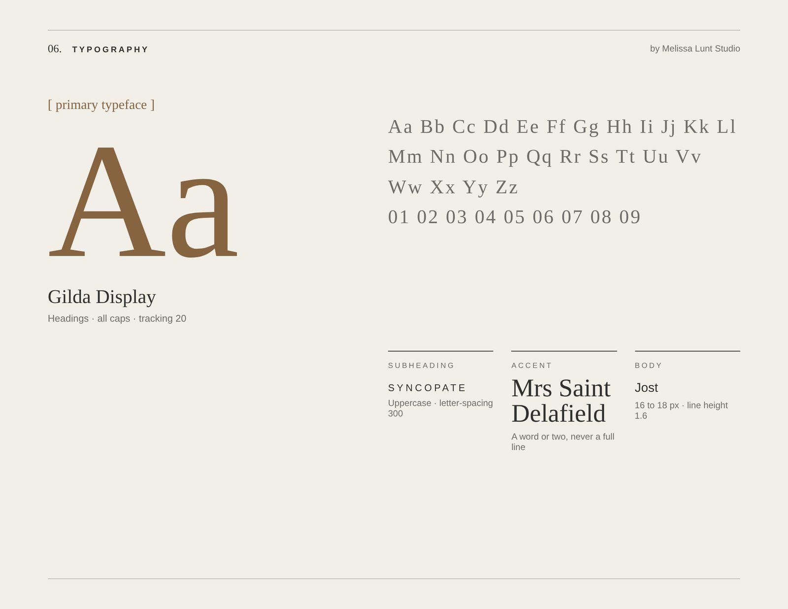
This is the section I’d spend the most time on. A font name and weight isn’t enough. If you only write “DM Sans Bold,” Claude will set your headline at default spacing, and it won’t look like the brand you designed.
For every type style, fill in:
- The font and weight
- The case (all caps, sentence case)
- The letter-spacing
- The line height
Quick conversion if you design in Canva: Canva’s letter-spacing is in thousandths of a font size, so -70 in Canva is -0.07em in code. Line height carries over as is, so 0.9 stays 0.9.
3. Spacing and buttons
Button shape, corner radius, padding and colors. Any spacing rules you care about, like generous white space or tight headline stacks.
4. Logo rules
Which logo goes where, the light version for dark backgrounds, clear space, and anything that’s off-limits (stretching it, recoloring it, putting it on a busy photo).
5. Voice
A few words that describe how the brand sounds, a couple of example lines, and words the brand never uses.
6. The rules at the top
This is the line that saves you a lot of fixing later: “If something isn’t listed, ask before choosing.” That one sentence is what stops Claude from inventing a seventh color.
What does a brand file look like? (example structure)
Here’s a simple structure. Every value below is a made-up example. Swap in your client’s real brand.
BRAND FILE: [Brand name]

RULES
- Use only the colors, fonts and logos listed here.
- If something isn't listed, ask before choosing.

COLORS
- Cream #F6F1EA: most backgrounds (example)
- Charcoal #2B2B2B: headlines and body text (example)
- Blush #E8C9C1: soft sections and cards (example)
- Terracotta #B5694A: accent only, buttons and small details (example)

FONTS
- Headlines: [Serif font], Regular, all caps, letter-spacing 0.08em, line height 1.0 (example)
- Body: [Sans-serif font], Regular, sentence case, letter-spacing 0, line height 1.6 (example)
- Accent: [Script font]. Use for: one short phrase per section, never body text (example)

BUTTONS
- Charcoal background, cream text, all caps, square corners (example)

LOGO
- Primary logo on light backgrounds. Light logo on dark backgrounds or photos (example)
- Keep clear space around the logo on every side. Never stretch or recolor it (example)

VOICE
- Warm, calm, a little romantic (example)
- Say: "your story," "the day you'll want to remember" (example)
- Never say: "elevate," "game-changing" (example)
Short, specific and boring to read. That’s exactly what you want.
Want a brand file template that’s already set up?
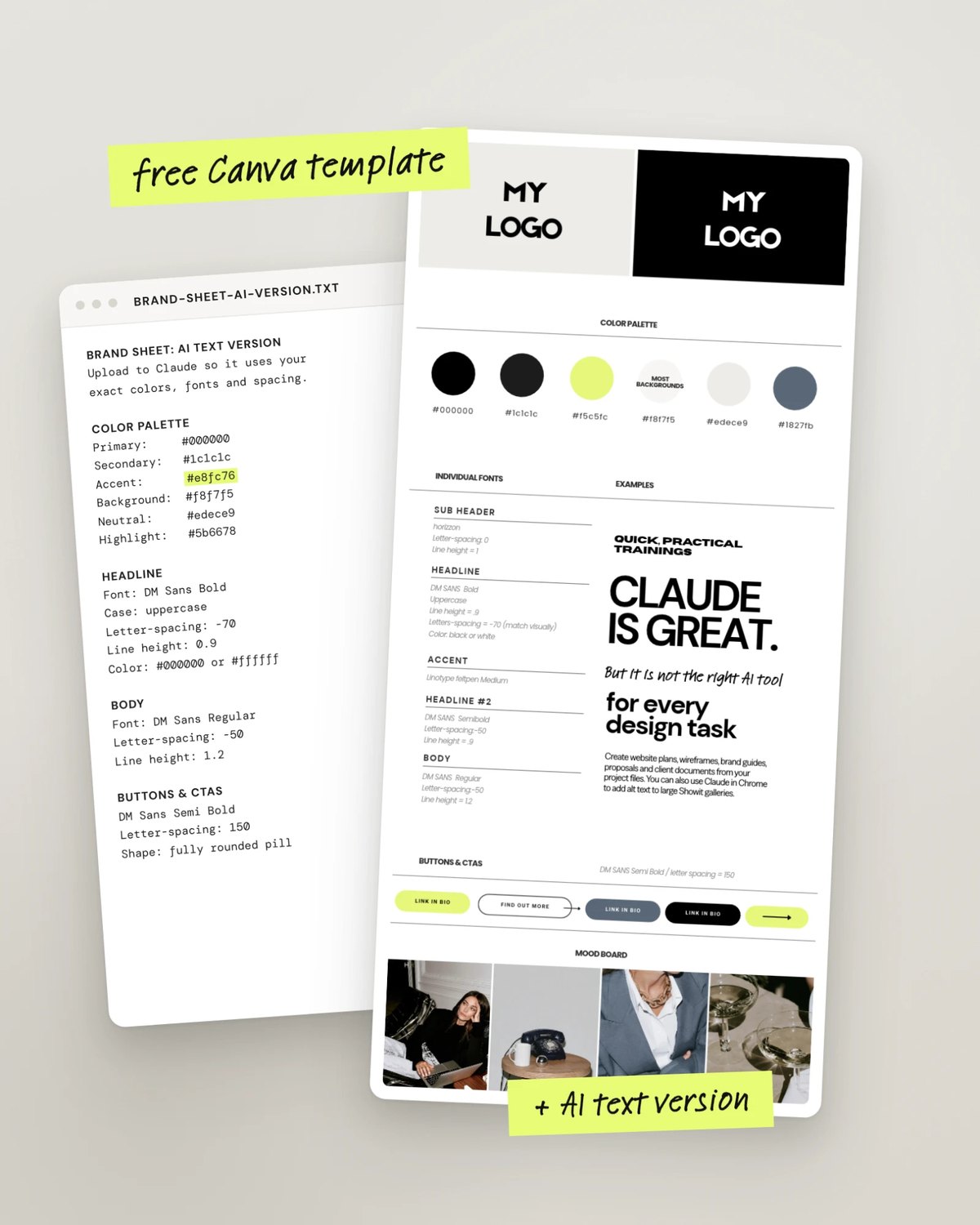
My free brand sheet comes with one. You get a fill-in-the-blank Canva template that puts the brand on one tall page (logos, colors, fonts, buttons and a moodboard), plus an AI text version you upload to Claude, so it uses your exact colors, fonts and spacing instead of guessing.
How do you use a brand file with Claude?
Here’s how I actually use it.
I make one Claude project per client and add the AI text version to the project’s files. From then on, everything I make in that project starts on brand: the proposal, the wireframe, the brand guide, the social graphics. (If wireframes are your thing, here’s how I use Claude to wireframe a website.)
Before I look at anything Claude makes, I ask it to check its own work:
“Before you show me this, check every color, font and button against the brand sheet and list anything that doesn’t match.”
The brand file gets the colors and fonts right, so you can spend your time on the parts that need a designer’s eye: the layout, the hierarchy, and whether the whole thing feels like the brand.
Should you give the brand file to your client?
Yes, I would. If your client uses Claude or ChatGPT for her own content, the brand file keeps what she makes looking like the brand you designed. It’s a small thing to add to your handoff, and it shows you’re thinking about how she’ll actually use the brand. (More on that in brand sheet vs. brand guidelines.)
FAQ
What is a brand file for Claude?
A plain-text document with a brand’s colors, fonts, spacing, voice and logo rules, written specifically enough that Claude can follow it exactly.
Can’t I just upload my brand board image?
You can, and it helps Claude get a feel for the brand. But an image doesn’t reliably give Claude exact hex codes, letter-spacing or usage rules. The text version is what keeps the details right.
Where do I put the brand file?
I add it to a Claude project for each client, so everything made in that project starts from the brand.
What’s the most important line in a brand file?
“If something isn’t listed, ask before choosing.” It keeps Claude from making up colors, fonts or styles the brand doesn’t use.
Want the full brand guides too?
A brand file keeps Claude on brand. If you also want to hand your client a mini brand sheet, multi-page brand guidelines and online brand guidelines, all styled in her brand, that’s what I made Brand Guidelines Builder for. It’s a Claude skill: fill in a brand form for a finished brand, drop it into Claude, and it builds the guides. You can see how it fits into a full handoff in how to give clients a high-end brand handoff.